

Bird’s Eye
Concierge Service
Anders Nord Studio was tasked with creating a new brand identity for Bird's Eye, a lifestyle management agency that offers customized experiences and services to their highly-regarded clients. The agency's commitment to understanding and honoring each client's individual needs, while maintaining high ethical standards and transparency, is at the heart of its mission. Bird's Eye takes a holistic approach to every aspect of its services, from the smallest details to the bigger picture, ensuring that every client can trust the agency to maintain a bird's eye view.
The Scope
Research & insights
Brand strategy
Brand design
Digital identity
Concept development
Site design
Visual identity concept
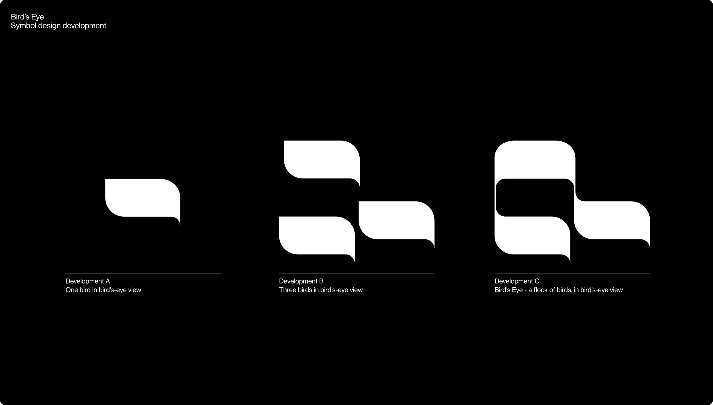
The Bird's Eye partnership is made up of three individuals. According to the ancient Greek scholar and mathematician Pythagoras, numbers held great significance, and he regarded the number 3 as the perfect number, representing harmony, wisdom, and understanding. This perspective has endured through time, and the number 3 is regarded as a symbol of unity, balance, and completeness.


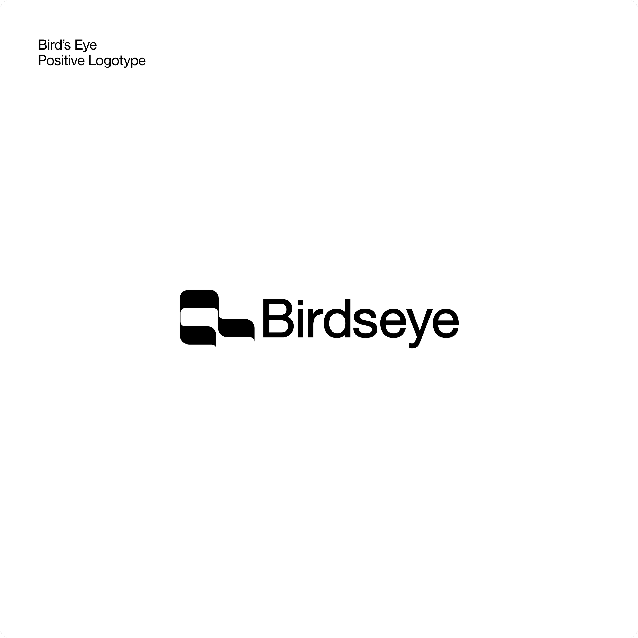
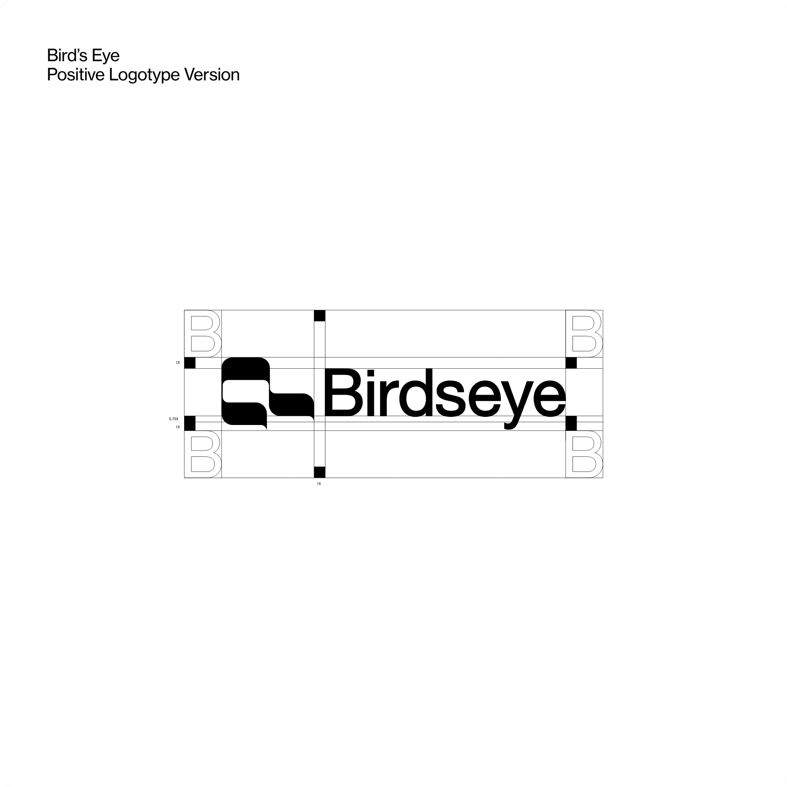
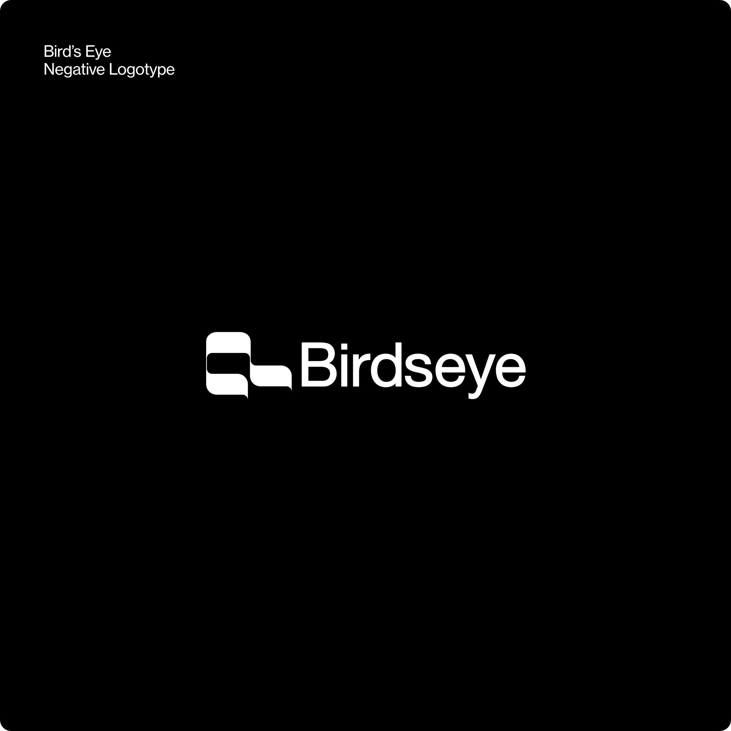
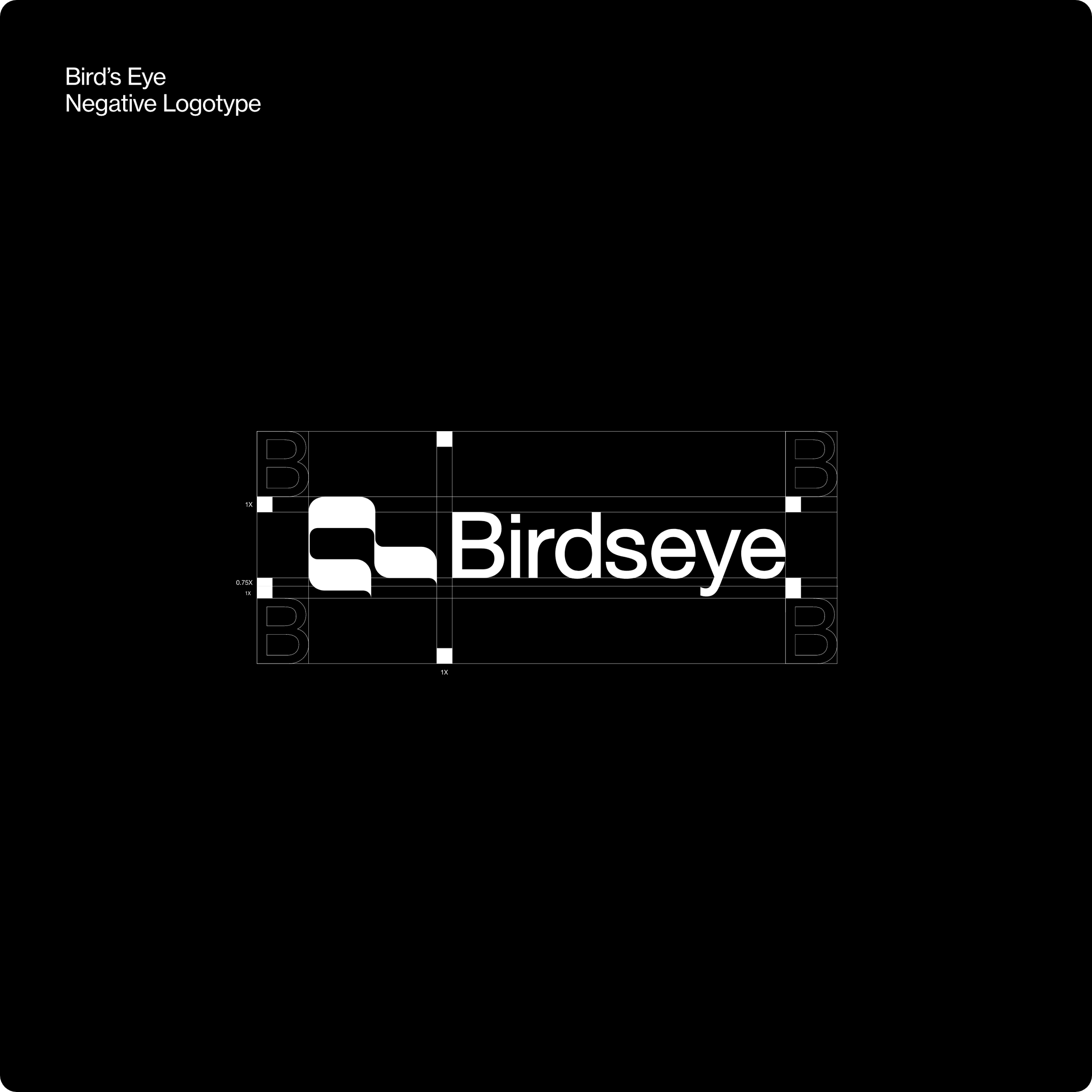
Logotype concept and design
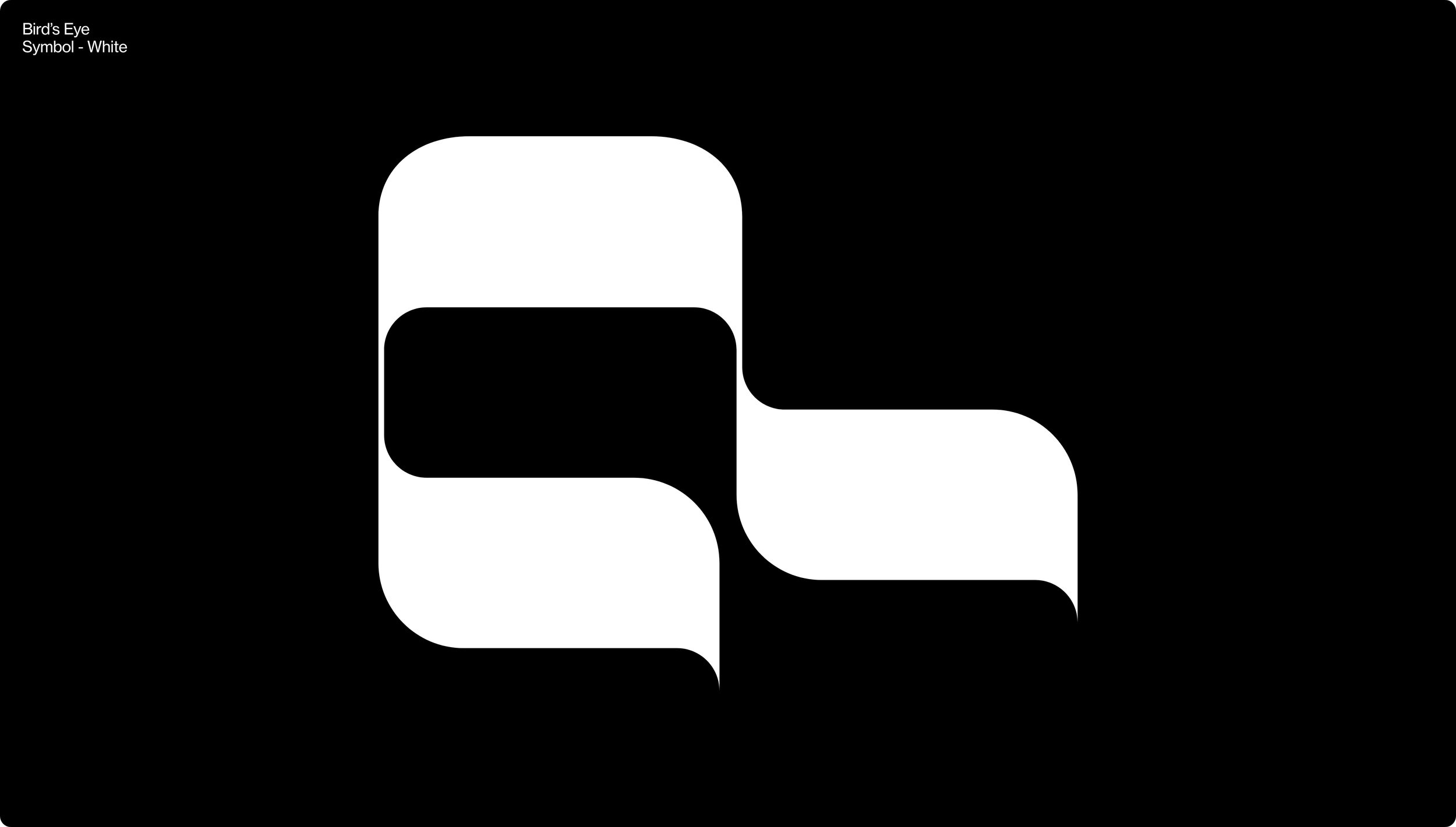
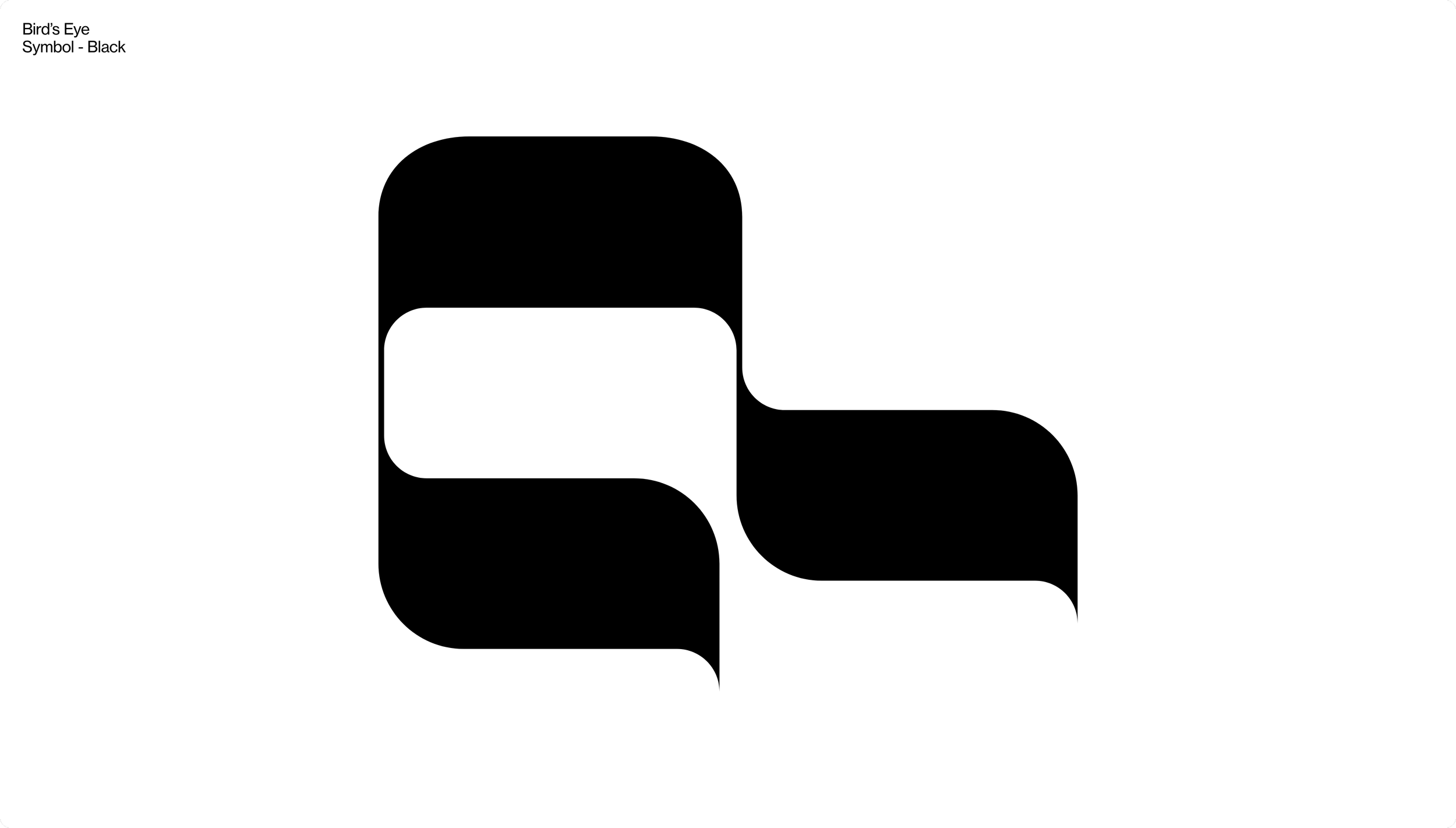
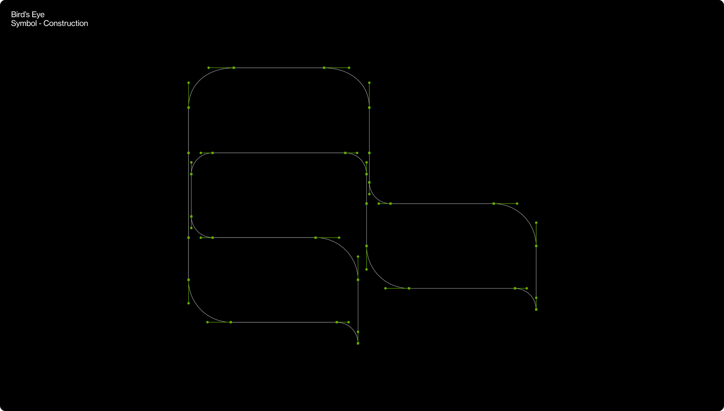
The "Flock of birds" symbol represents three birds in bird's-eye perspective observing everything that happens to their customers. This symbol is designed to convey the message that Bird's Eye is always attentive and ready to provide support around the clock, 24/7.
To create this symbol, we drew inspiration from three sources: the shape of the letter "b", the bird's-eye perspective, and the number three. By combining these elements, we were able to create a unique and recognizable symbol that conveys the core values of the Bird's Eye brand.


Colour palette & Typography
Bird's Eye color palette consisting of black, white, and green. The combination of black and white denotes the active state of Birds Eye, while the color green signifies execution. The brand's typography is strict and clear, conveying reliability and professionalism. Together, the color palette and typography create a powerful brand identity that reflects Birdseye's commitment to action and delivering high-quality results.


Layout system concept
Bird's Eye's customer assistance and supervision areas are identified by coordinates that are viewed from above, providing a bird's-eye perspective. These coordinates serve as the starting point for our layout system, which is built on a foundation of these baselines. We then use this layout system to integrate valuable information, compelling stories, and meaningful data to create a seamless and engaging customer experience.

Bird’s Eye visual identity
Bird's Eye's visual identity is a unique combination of strict and organic elements that come together to form a cohesive brand image. The brand's visual identity is defined by a set of strict design guidelines that ensure consistency and clarity across all touchpoints. This includes a carefully chosen color palette, typography, and layout that create a clear and recognizable visual language for the brand.


