

Schörling AB
Investment Company
Background
A small family business with large holdings
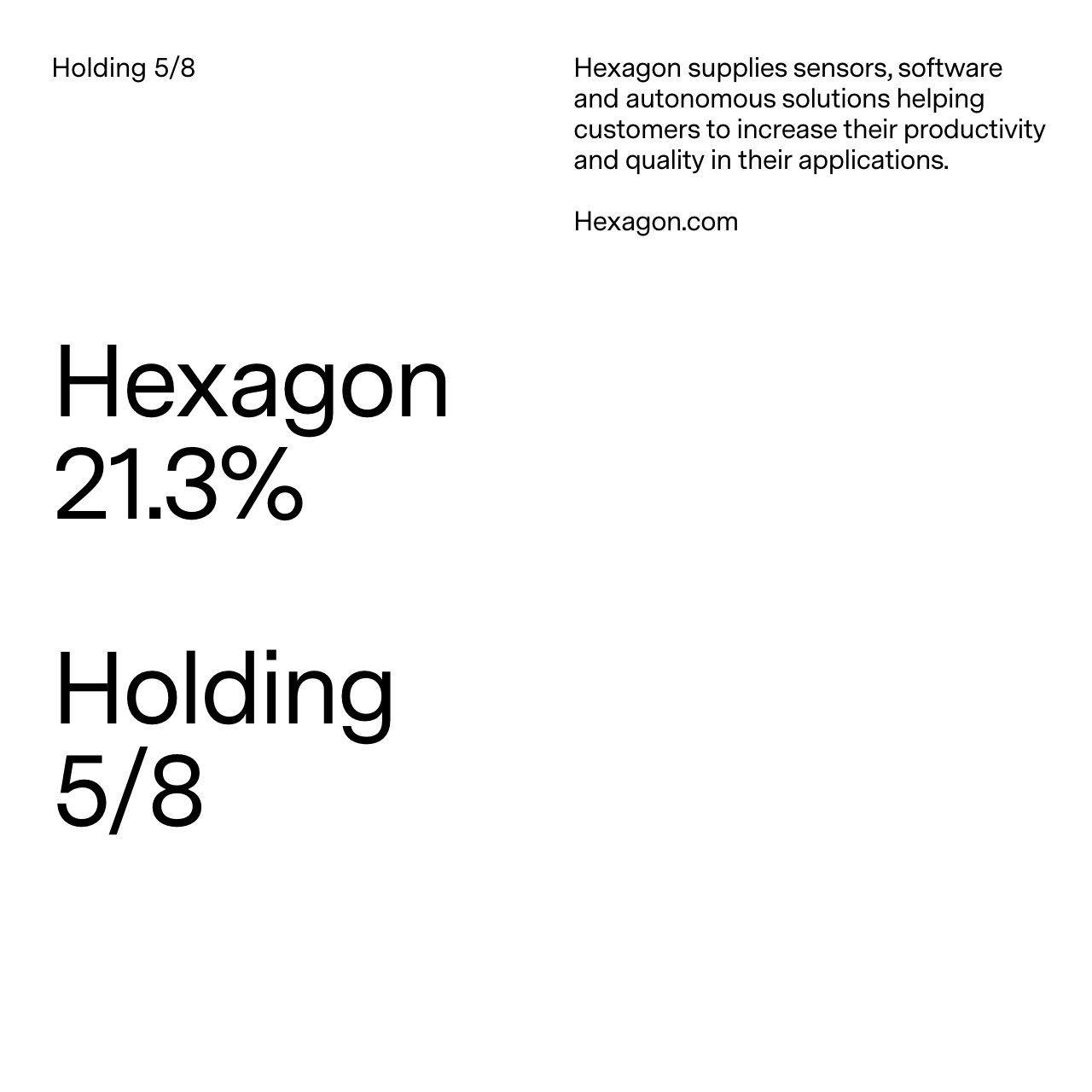
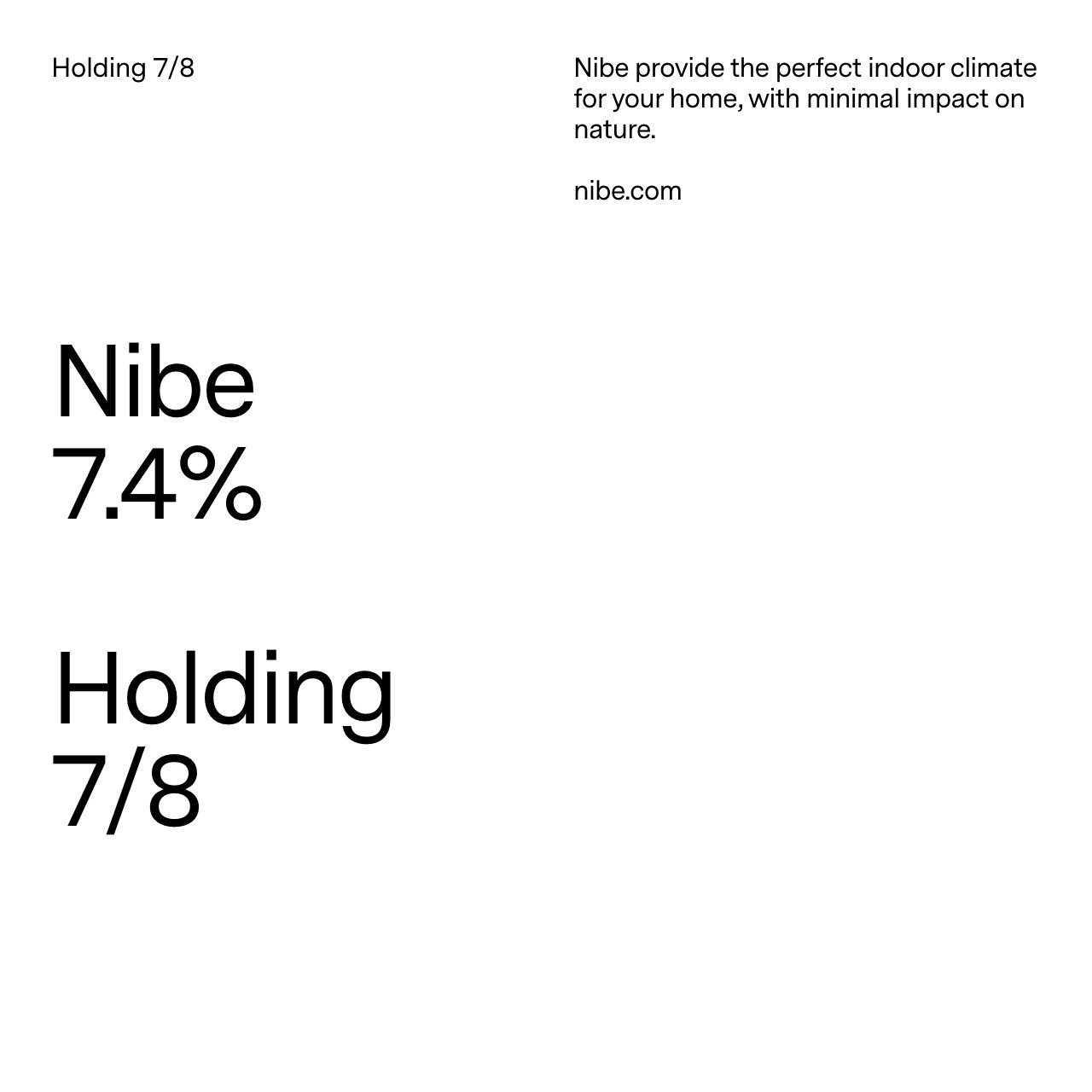
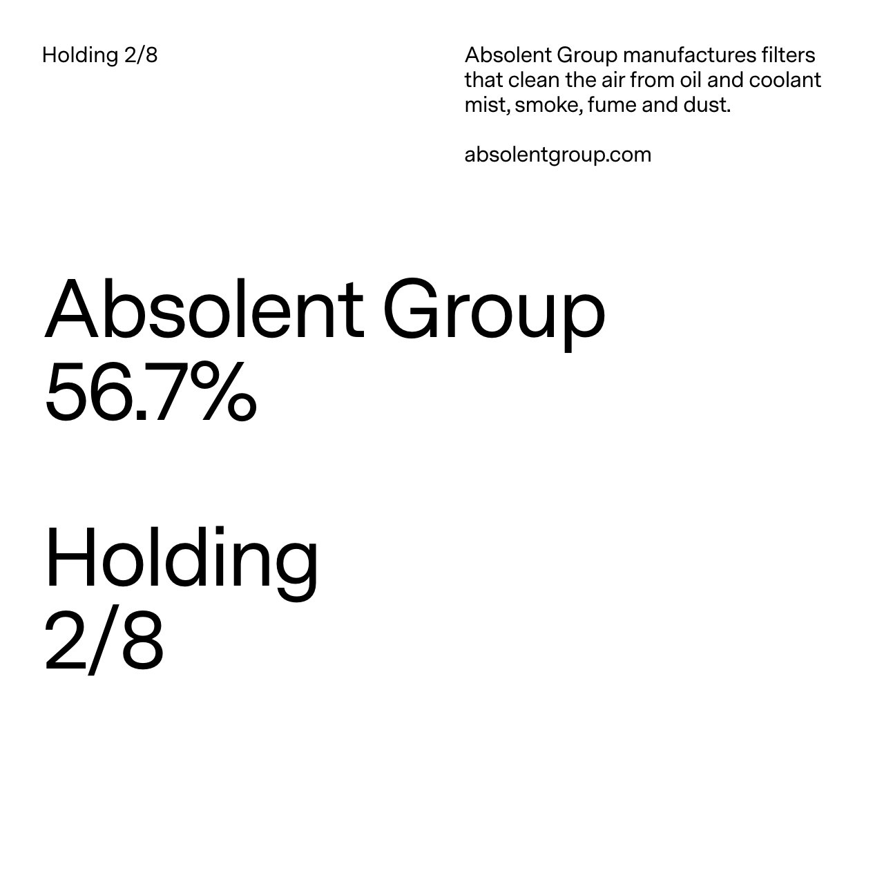
In 1987, Melker Schörling became the CEO of Securitas. He made his first major investment in the company the same year. A little more than ten years later, he ended his operative career to start his company MSAB, Melker Schörling AB. As an active owner, his focus has always been the development of industrial companies together with talented leaders. Schörling is a major shareholder in a handful of publicly listed companies, all of which are market leaders.
Challenge
Time for the second generation
When the time came for the second generation to take over, the company expression and brand identity needed to be modernised. Neither the visual identity nor the website had been updated since 2006. In an industry where the tonality is very distant and academic, and the graphic identity is often very standardised, the Schörling sisters looked for something that could express their core values going forward. It needed to be modern yet grounded in their history. It needed to express both Melker and his daughters. Being an active owner puts great demands on the management where important decisions are made. Schörling therefore need simplicity and calmness around them. Melker Schörling always said “It’s all about the people” which needed to be expressed. Also, since the second generation is taking over – would we need to modify the company name?
Outcome
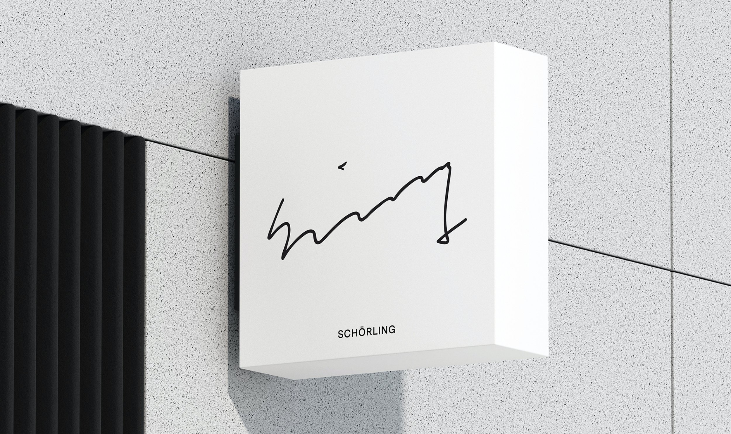
The signature
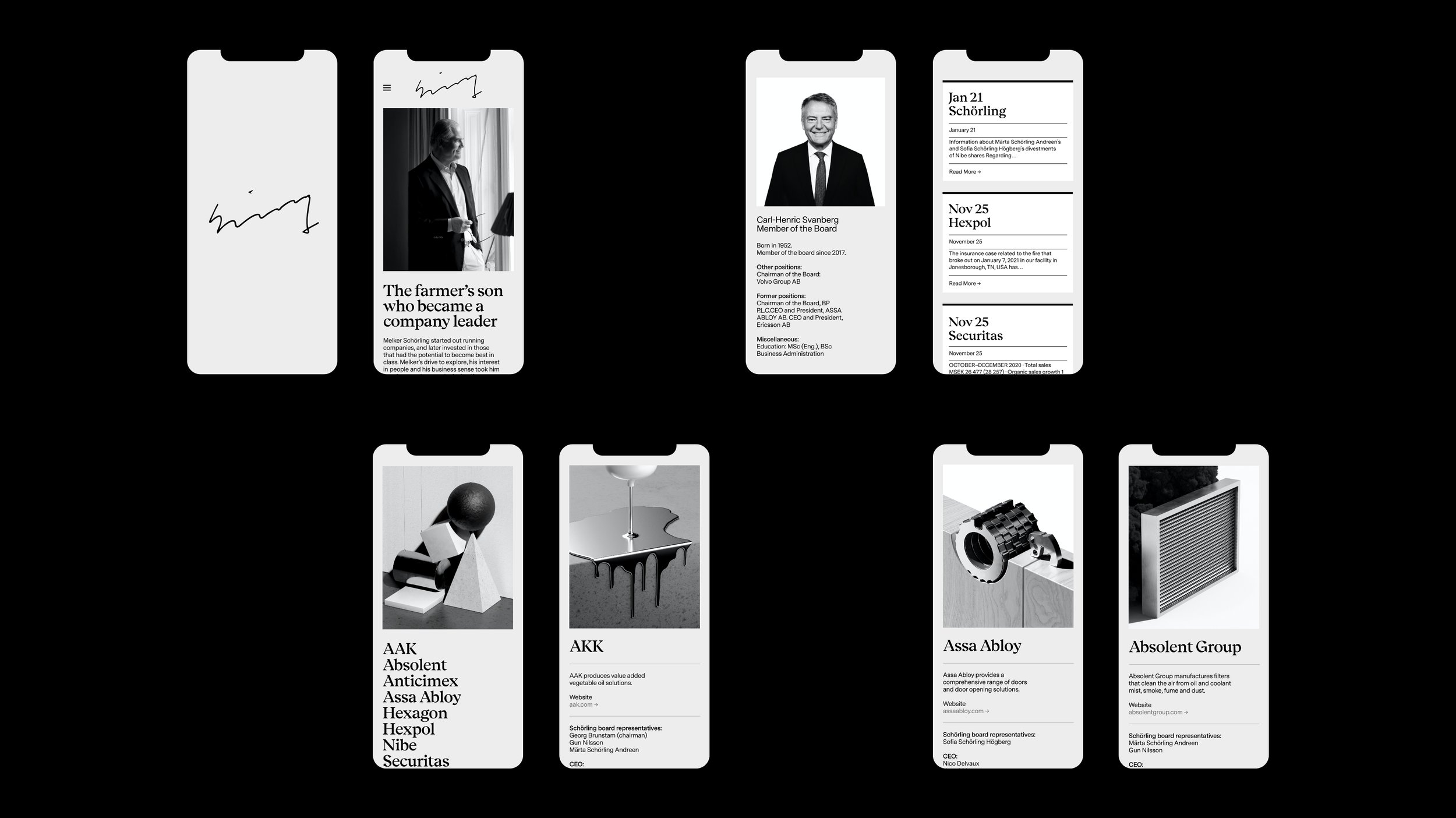
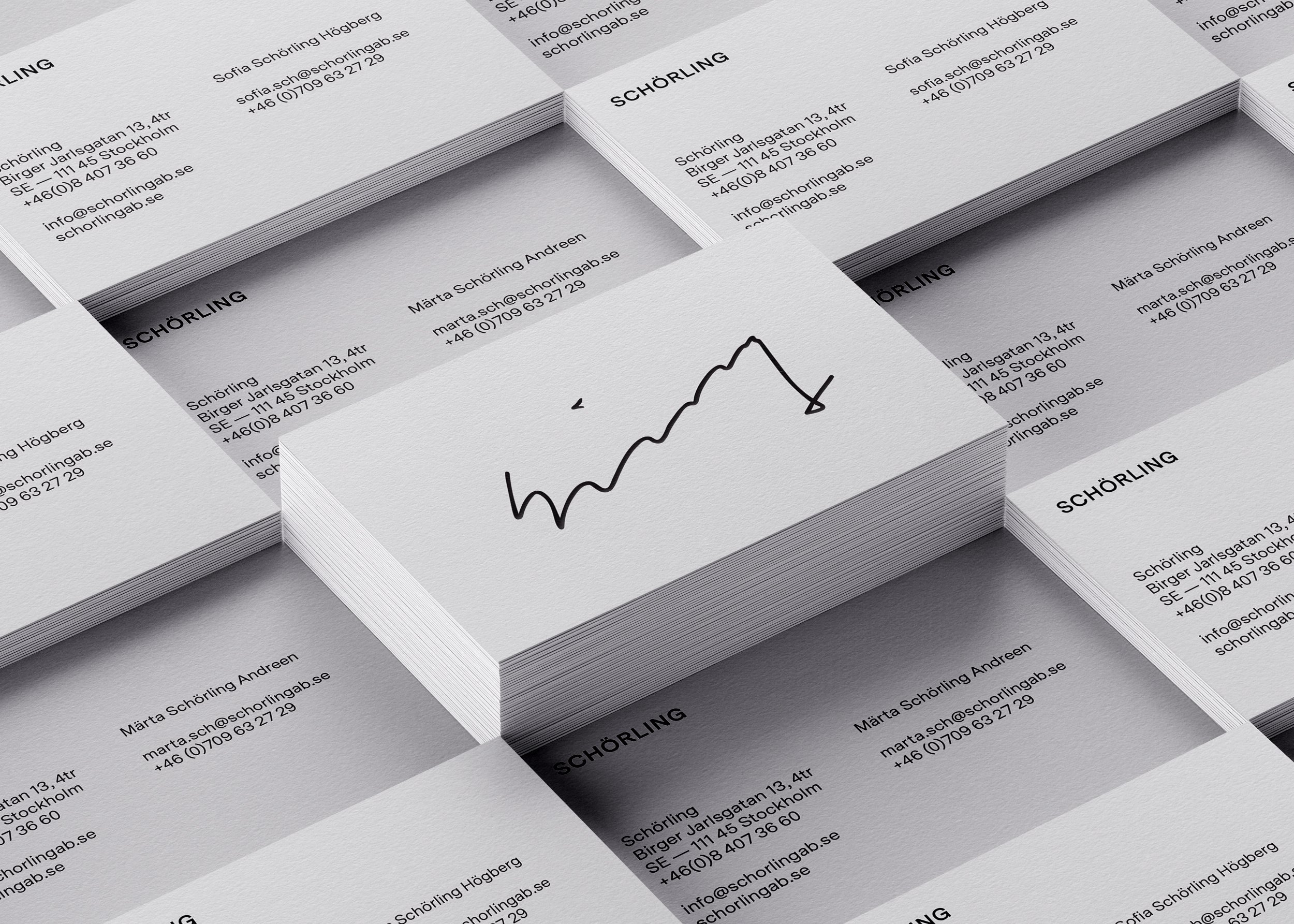
As a first step to becoming a family-owned company, it was decided to emphasise the family’s surname, Schörling. Melker has always followed his instincts, and put his signature on the projects he anticipated having good development potential. As a result, the new company logotype became Melker’s written signature – to mark the transition of leaving the company to his daughters. In this way, his personal handwriting becomes a trademark and reminder that his beliefs and aspirations will continue for generations to come. It is also a reminder of Melker’s philosophy: “It’s all about the people," and stands for personal commitment, passion, loyalty and focus on what can be achieved collectively.
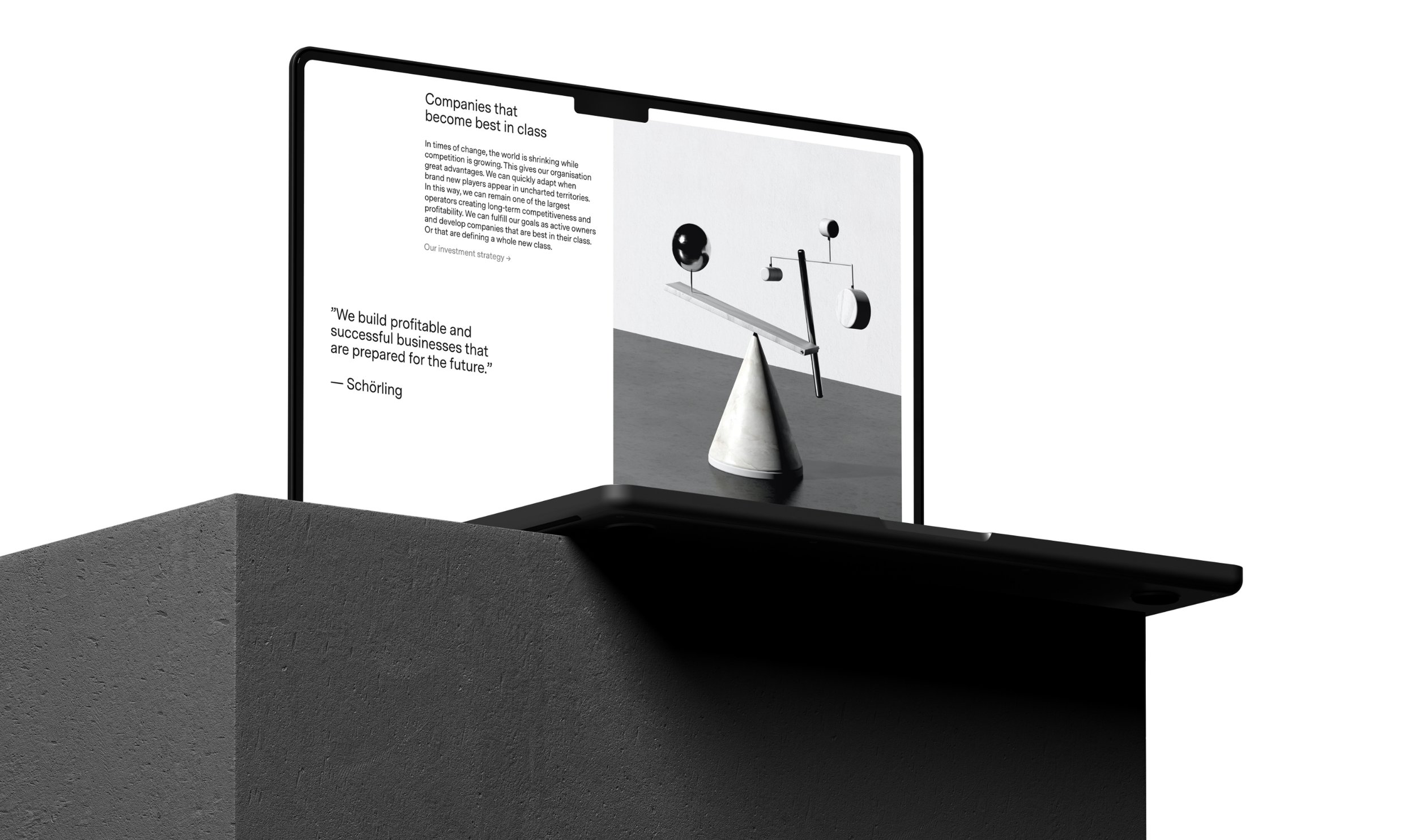
The directional idea of Schörling's visual identity is a combined contrast of the calm they need when making important decisions and Melker's dynamic leadership as a businessman. We created tailor-made concept imagery that is playful and minimal at the same time. We based the grid system on their eight company holdings (eight also represents infinity and a constant flow of energy and power). The typography is set in two contrasting styles where a quote from Melker Schörling has been a guiding inspiration. And the copy on the site was created to give Schörling a progressive, open and authentic tonality. The overall expression is what we intended – something modern, but with a legacy, sturdy yet dynamic.
Project Scope
Interviews
Research & Insights
Brand Identity
Identity design
Design Systems
Concept development
Copy tonality
Copywriting
Photography Style
Art Direction
Design Implementation
Site design
Programming


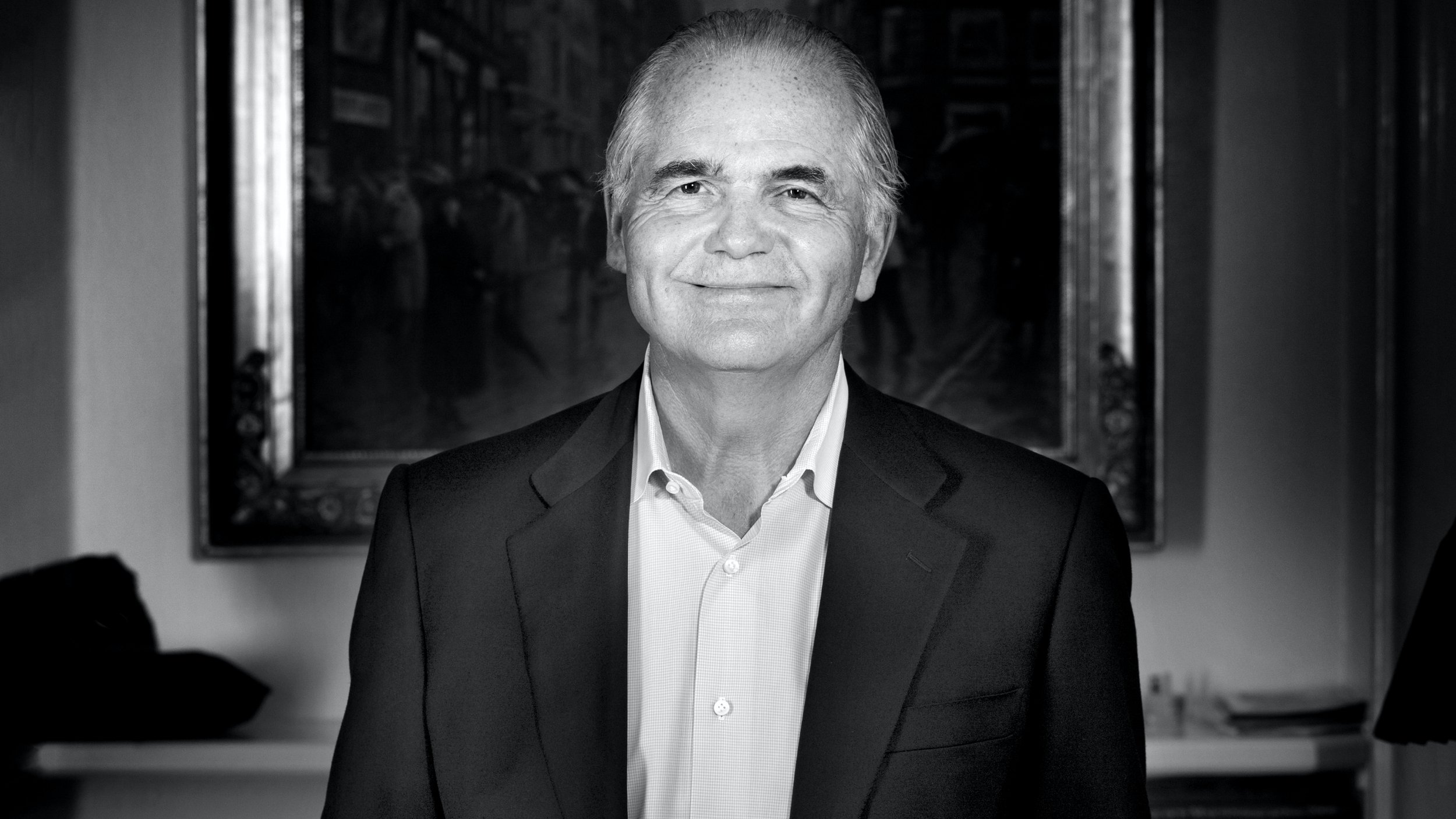
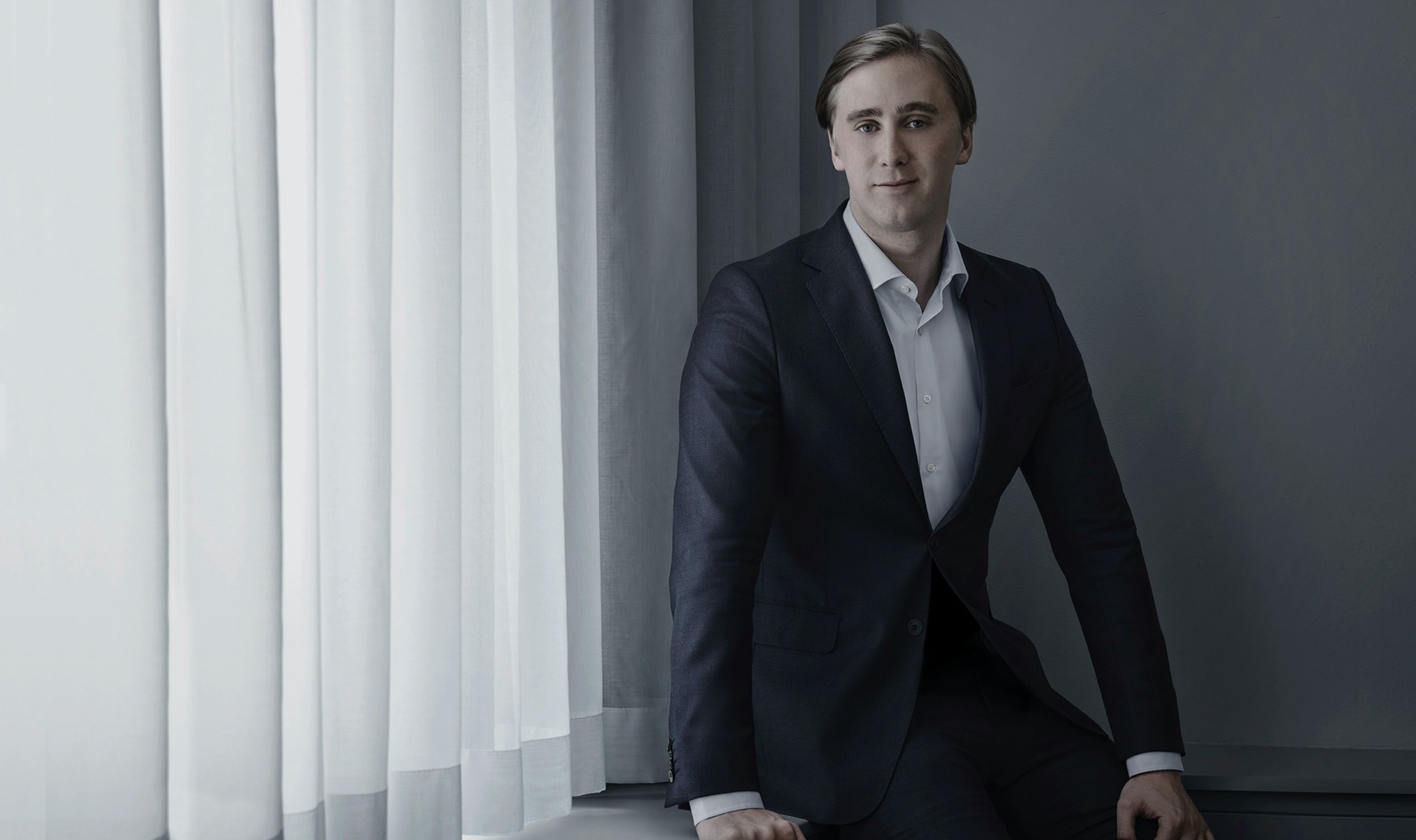
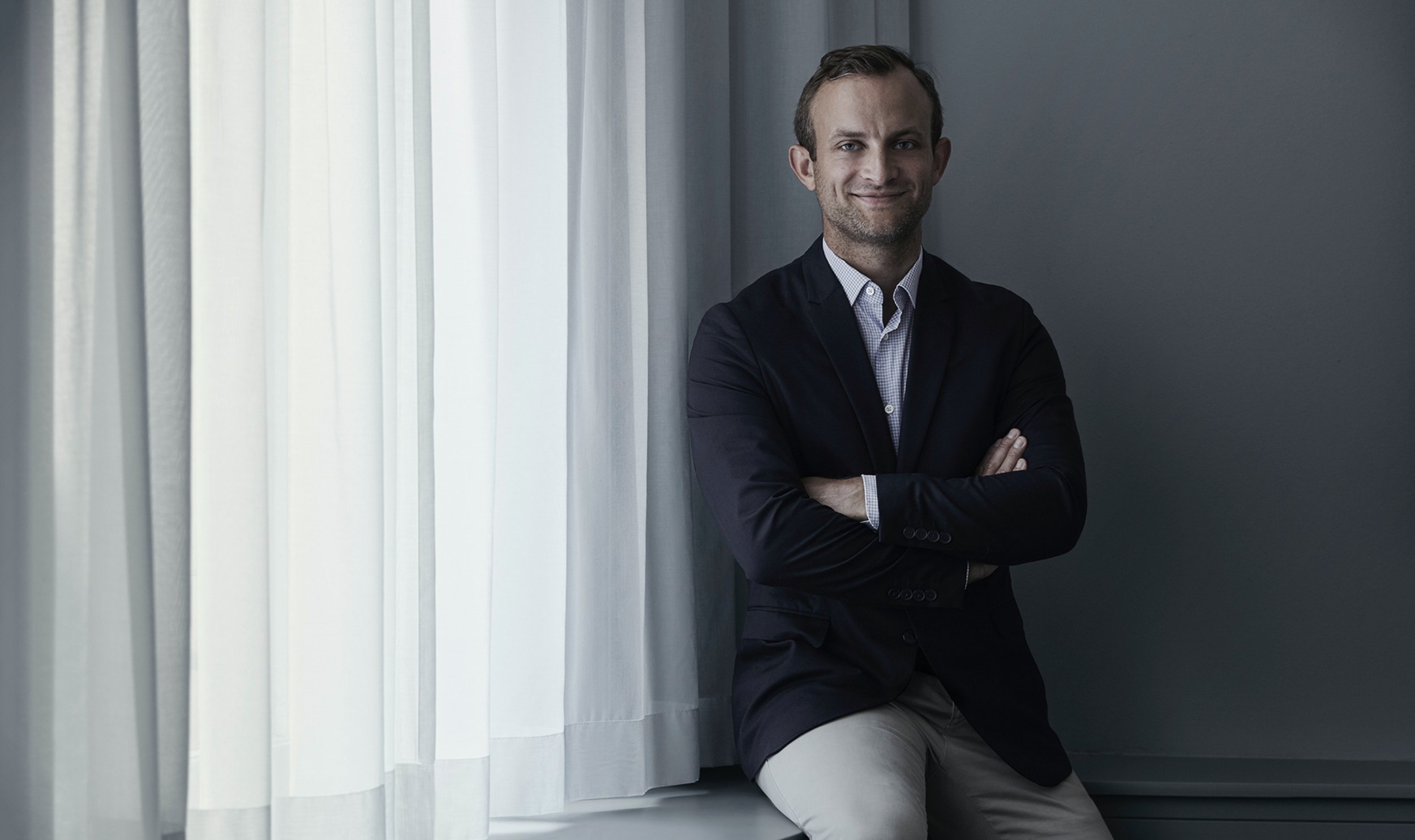
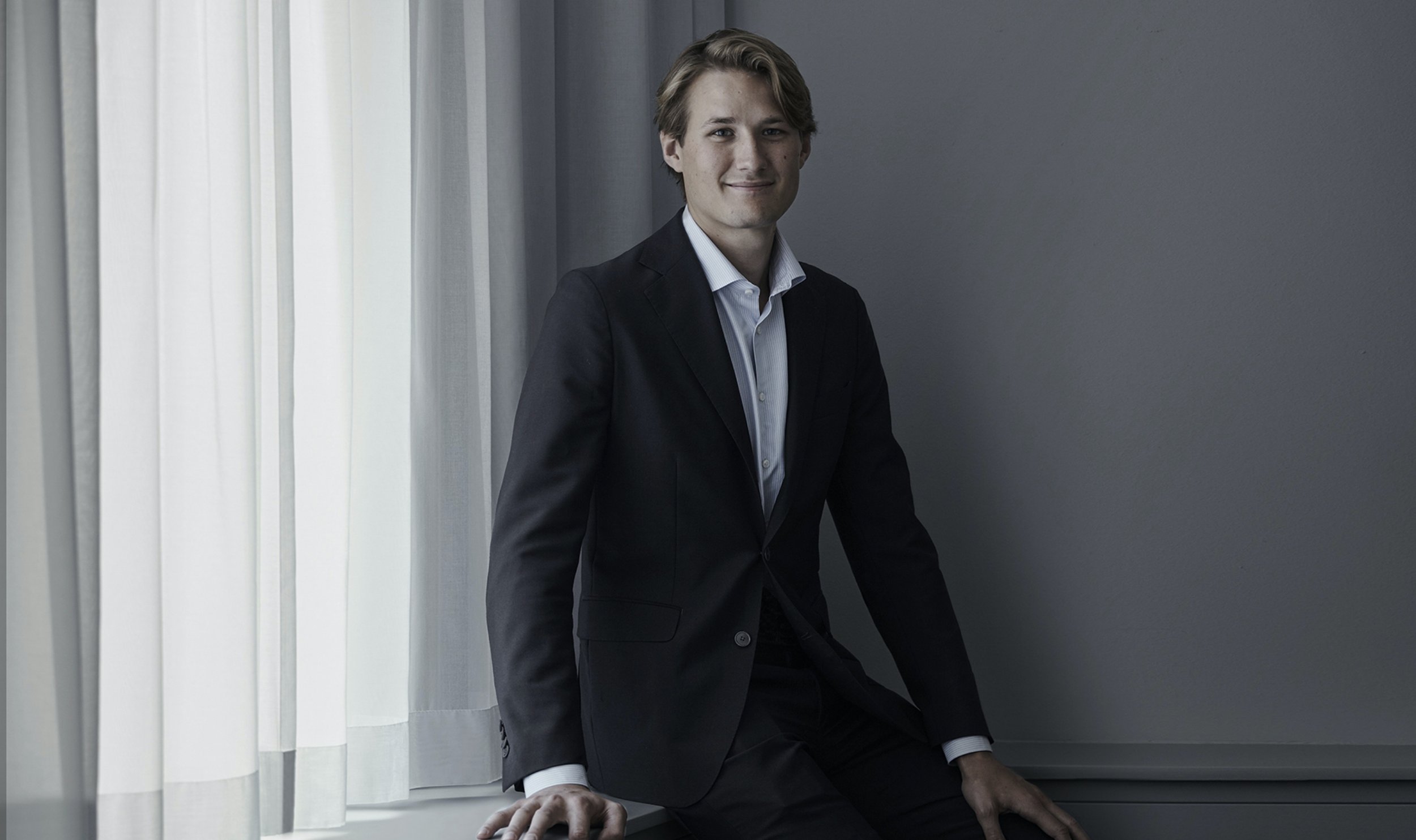
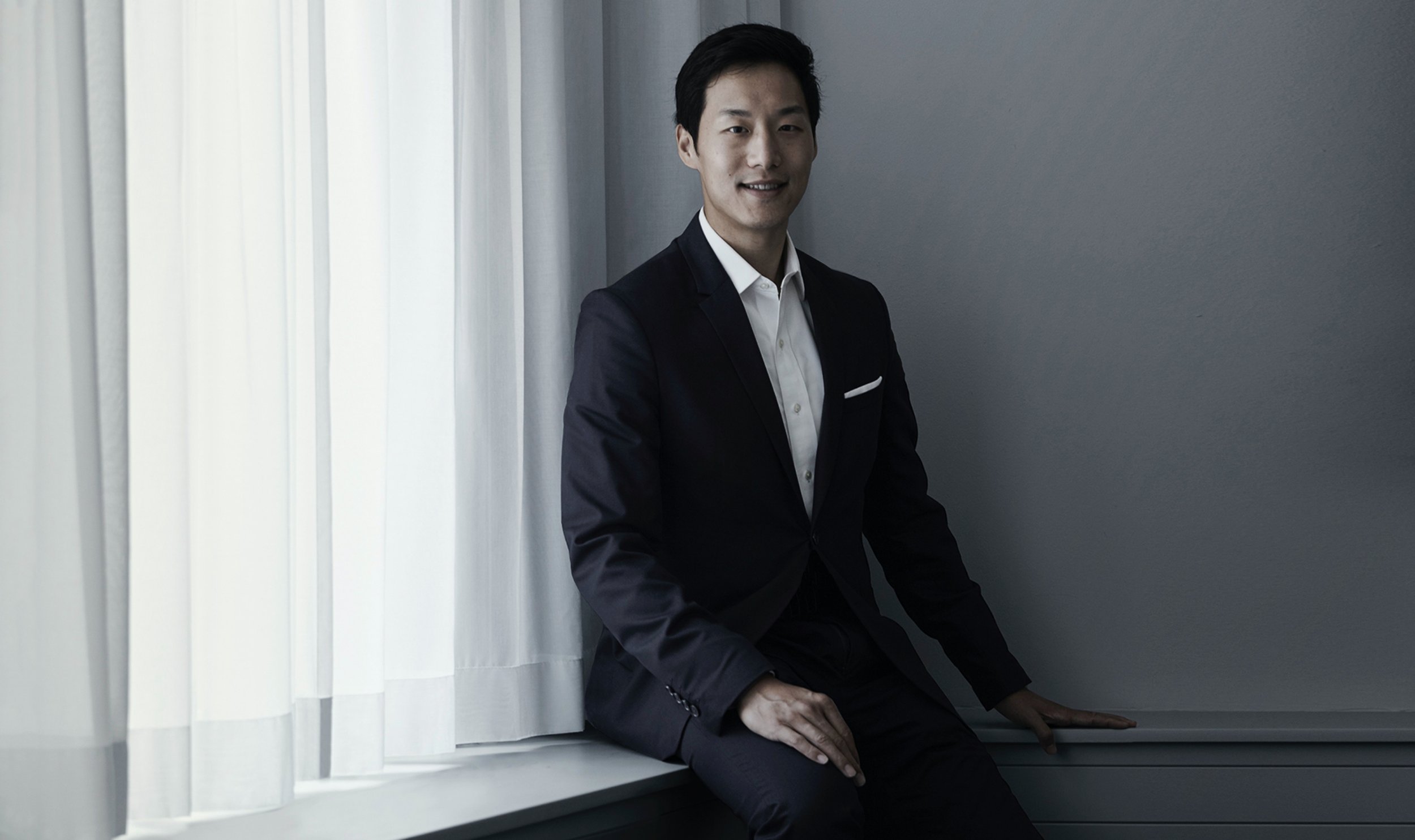
Portrait photography
Art direction and photoshoot of the board and management in central Stockholm.

Märta Schörling Andreen — Member of the Board

Sofia Schörling Högberg — Vice chairman of the Board

Mikael Ekdahl — Chairman of the Board

Carl Bek-Nielsen — Member of the Board

Carl-Henric Svanberg — Member of the Board

Gun Nilsson — Member of the Board

Grid System
We based the grid system on their eight company holdings (eight also represents infinity and a constant flow of energy and power)

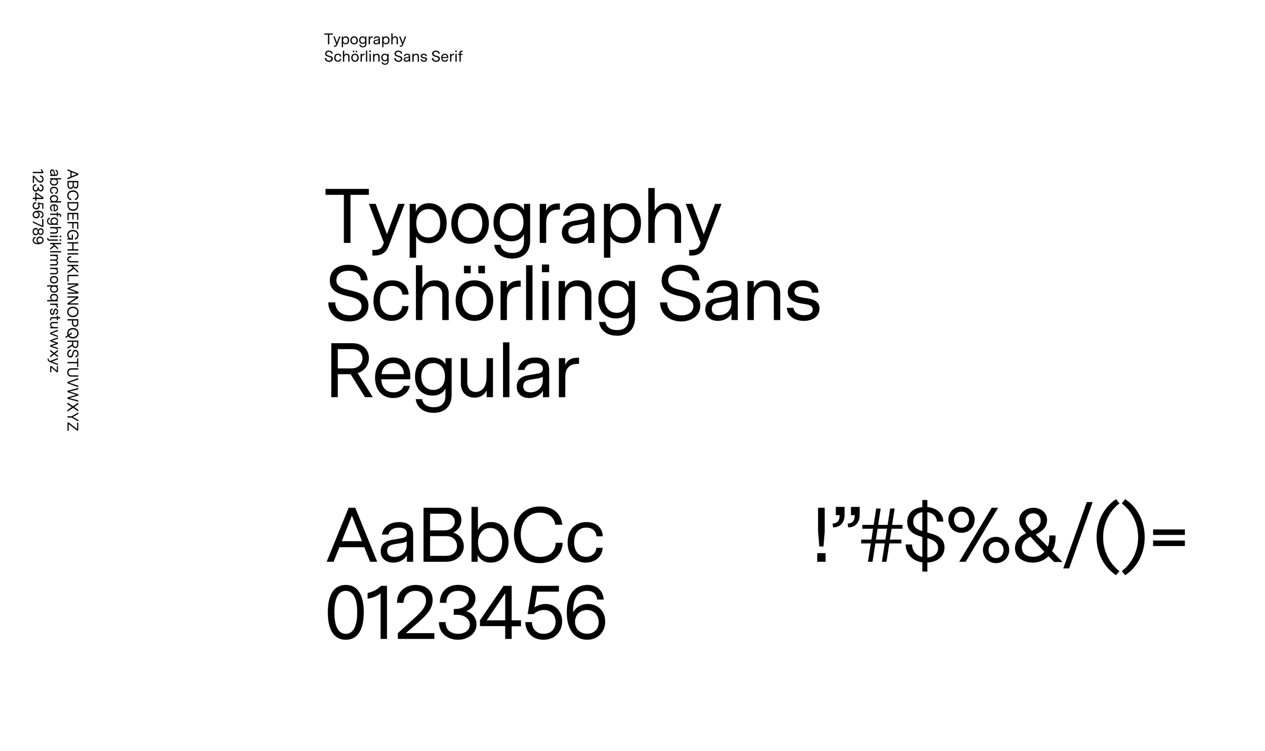
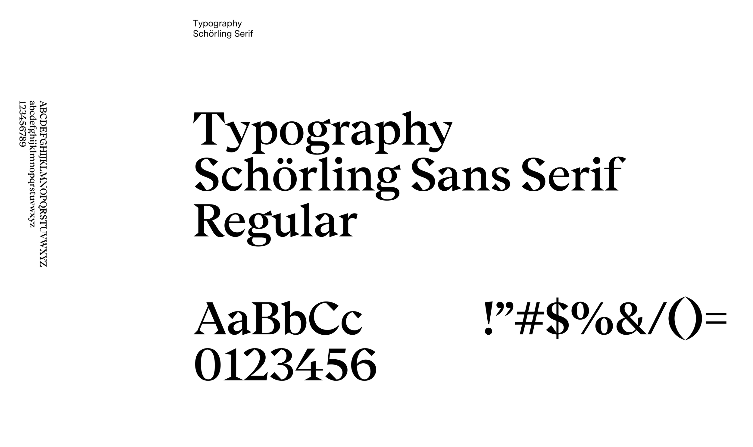
Typography
The Schörling typography is based on two contrasting parts – the sans typography represents serenity and simplicity. The sans serif type is based on Melker Schörling's quote: "A great blacksmith recognises another great blacksmith," which is translated into a blacksmith bending steel.
Colour palette
Important decisions are always being made, therefore Schörling should reflect assurance and calm resolve.


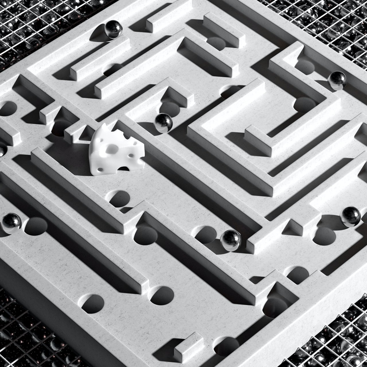
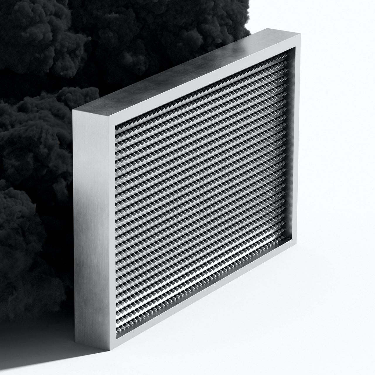
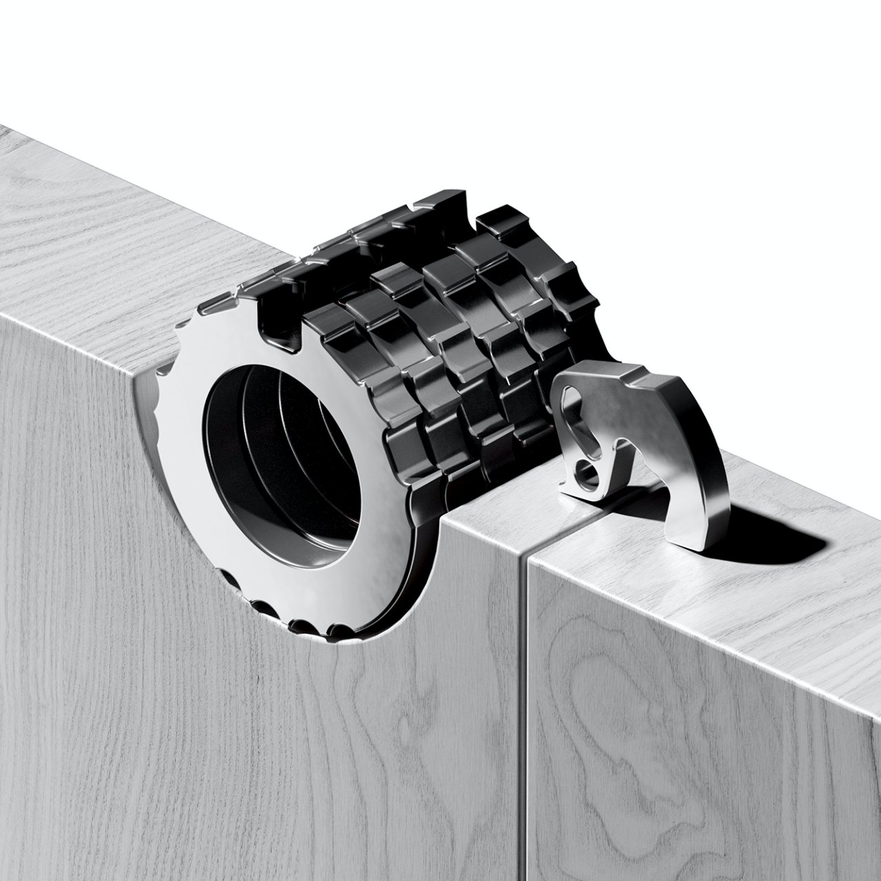
Conceptual imagery
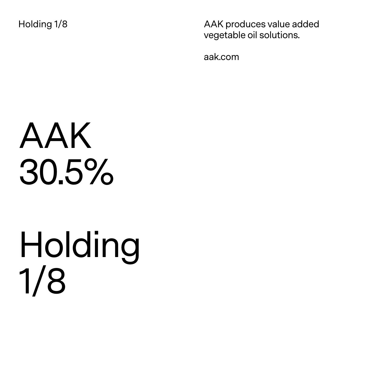
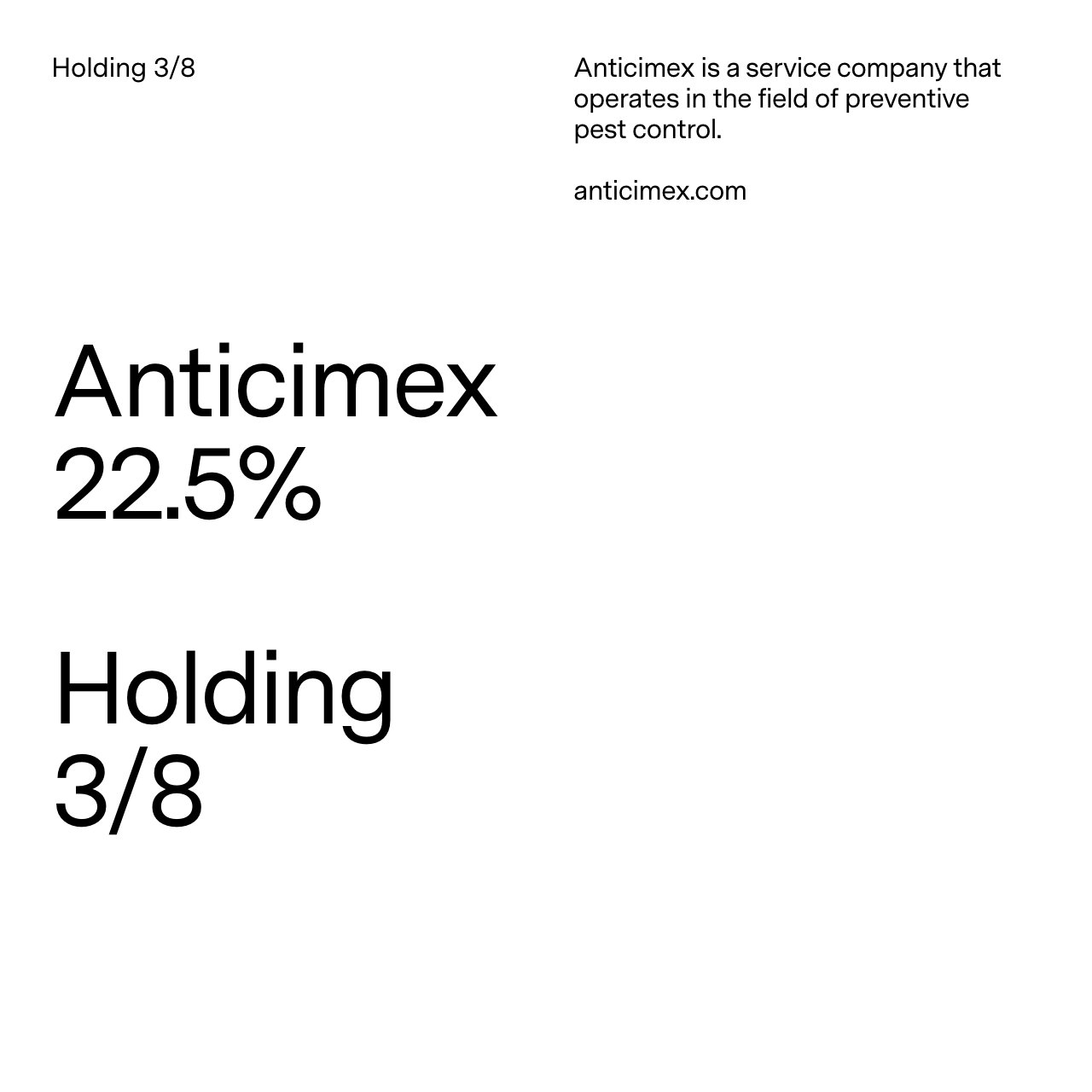
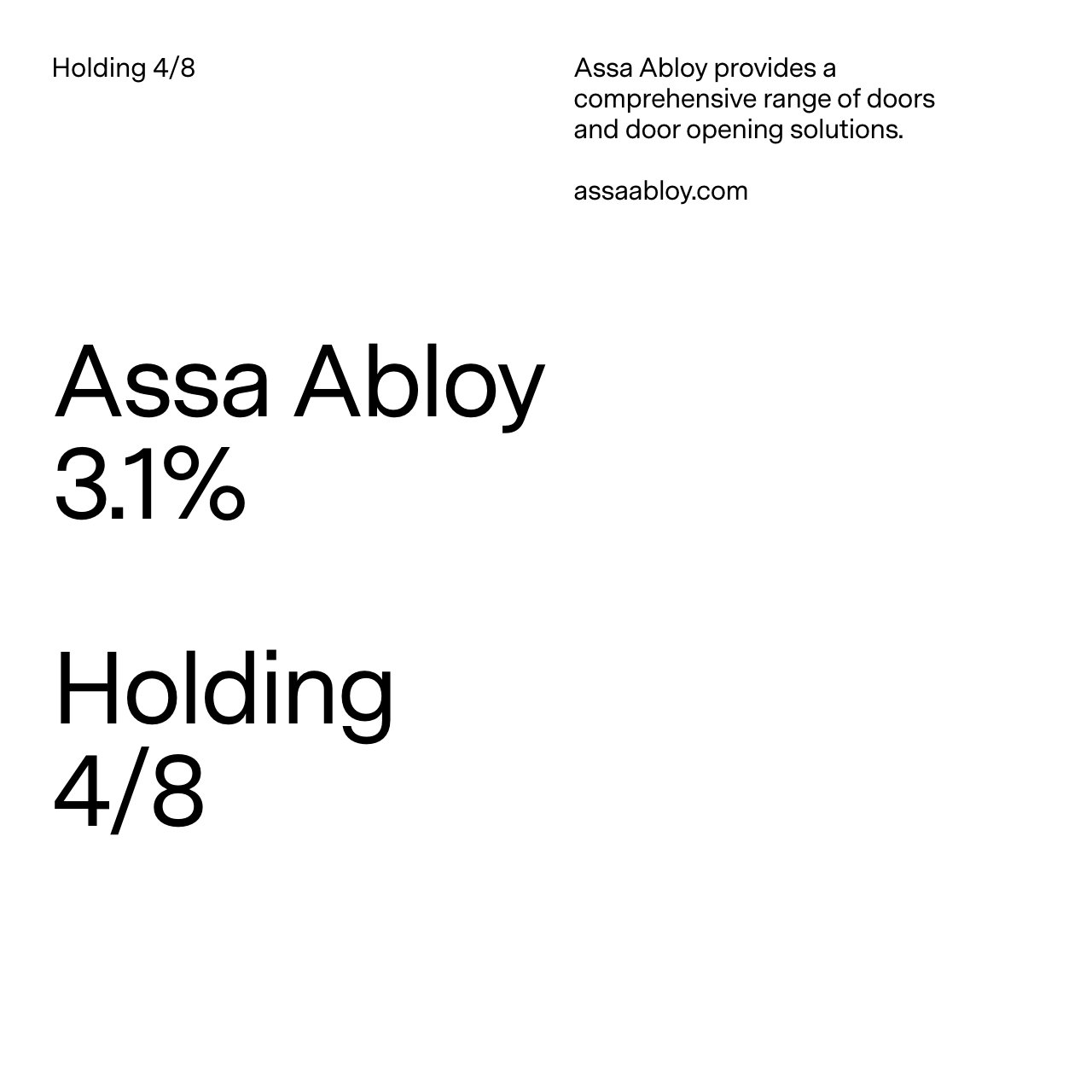
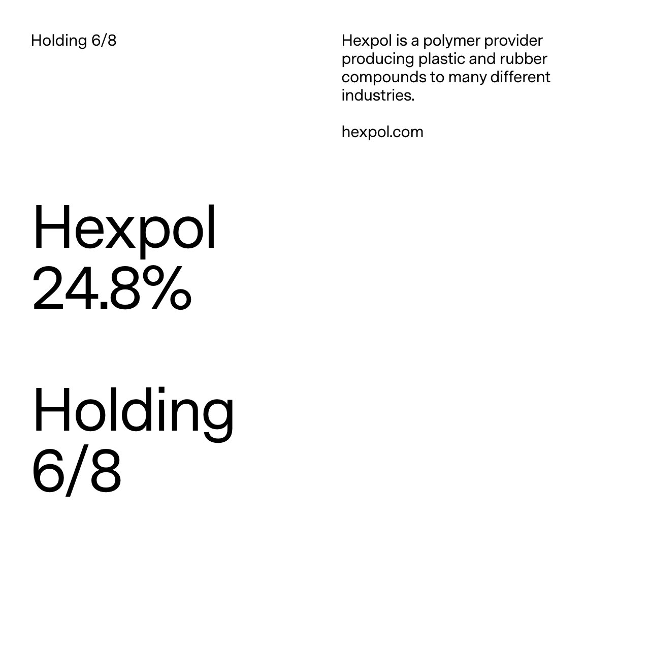
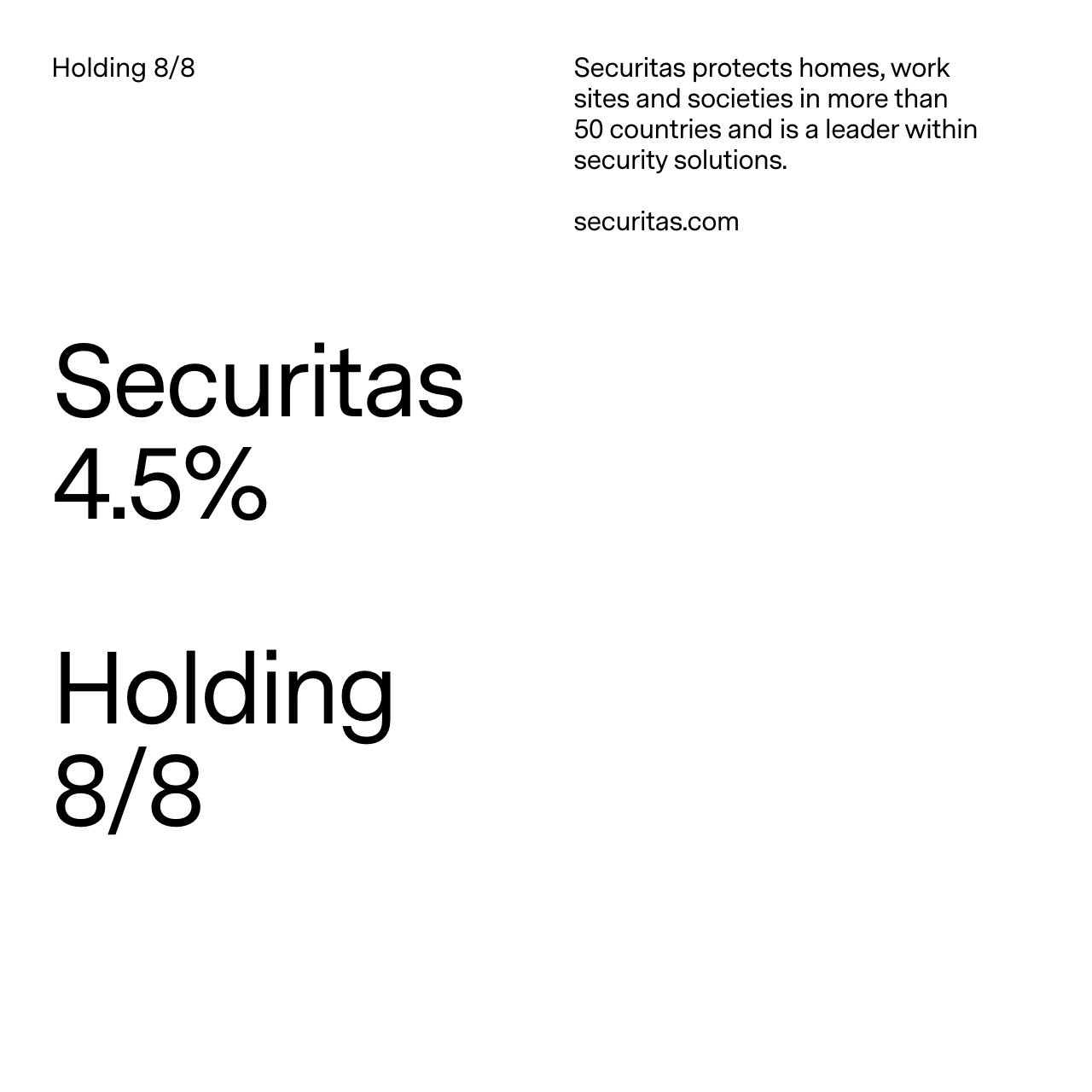
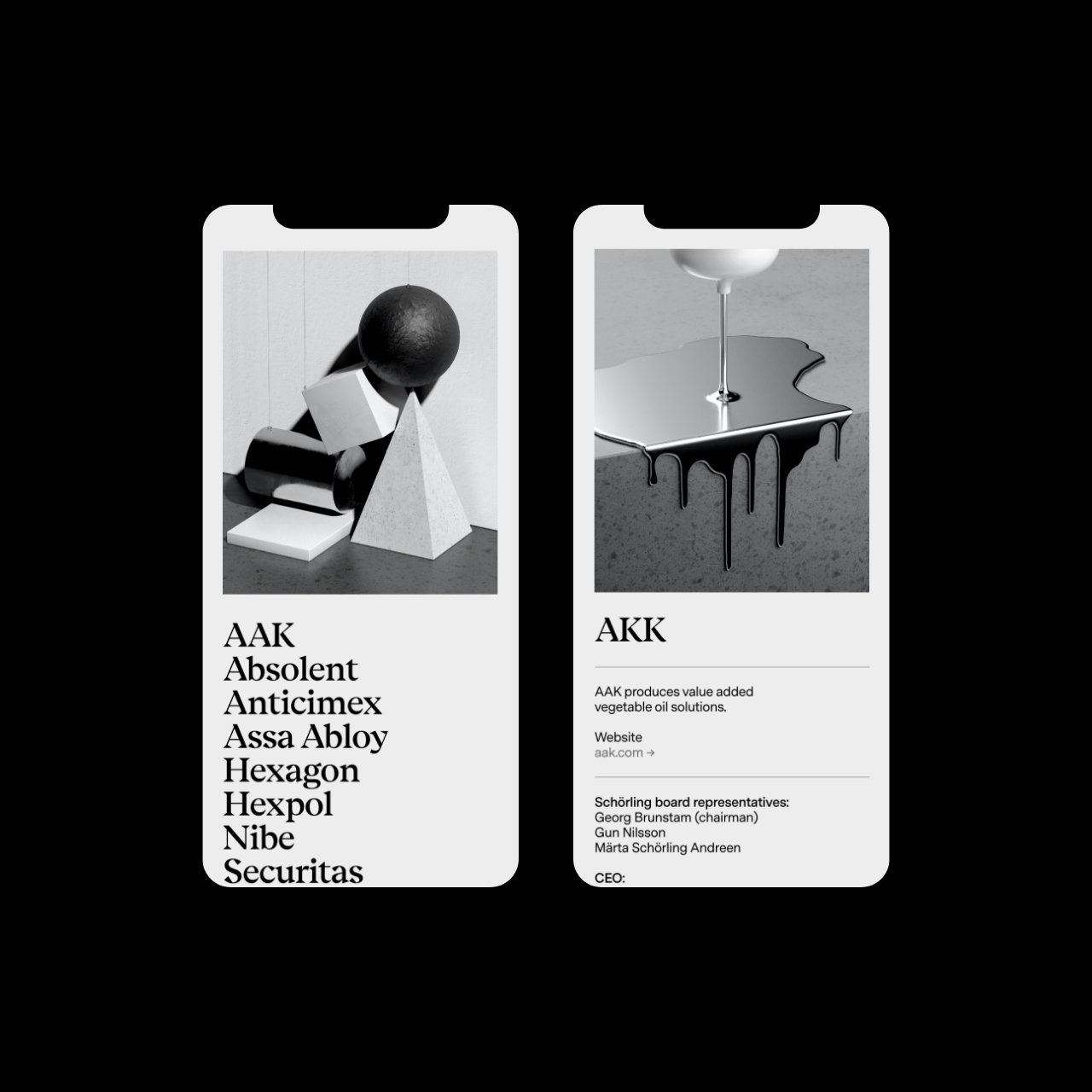
Schörling has eight holdings that are global market leaders with roots in Scandinavia. We created eight conceptual images to represent each holding.


The Schörling office in Stockholm, Sweden.
Trainees—the first step to a leadership position.
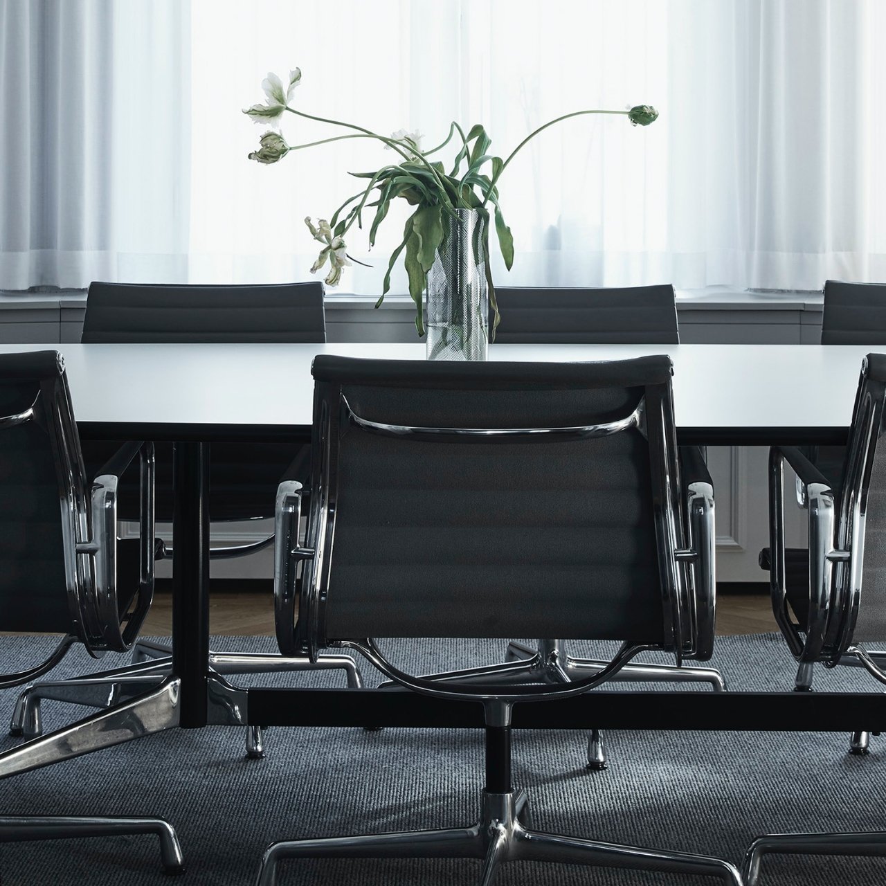
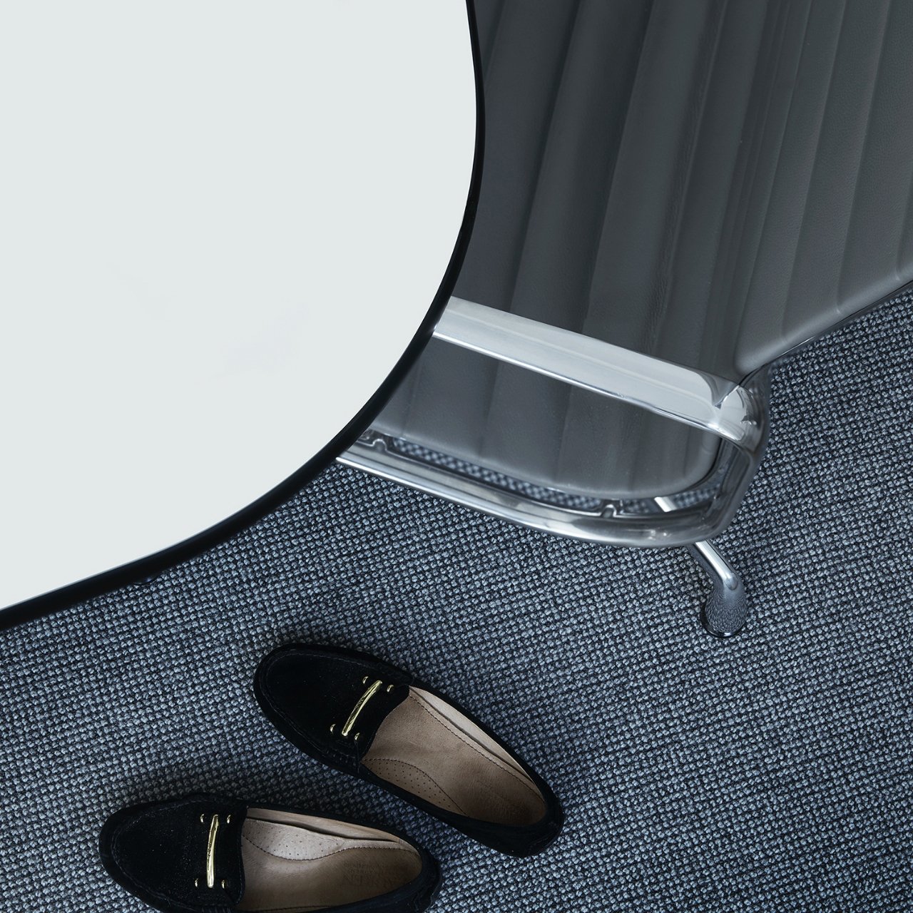
The boardroom.

Executive assistant Annette.


Site design
Something modern with roots in the beginning. Something steady yet dynamic.


Logotype
The Schörling Foundation
The Schörling Foundation was instituted by the Schörling family in 2014. The Foundation is run without profit and has its financial base in a donation made by Melker Schörling, the founder of the company. The Foundation’s purpose is to promote scientific education and research.